How does logo design start? Thinking through the idea of a graphic sign? Or font selection? Or maybe from a modular grid? It is difficult to say, since different approaches are needed in different cases. However, many designers who already have a rough idea of what a logo should look like begin by creating a modular grid. Using the grid allows you to create a harmonious, geometrically verified and well-organized logo that can be subsequently reproduced in any size.
The modular grid is a very useful tool in a designer's arsenal. Especially for beginners - even by mastering the basics of working with guides, you can avoid many design mistakes. Most often, a regular square grid with cells of a given size is used, but this does not mean at all that it is necessary to use this option. The structure of the grid for creating a logo can be any, for example, it can be a combination of horizontal, vertical and inclined guides that interact with circles of different diameters. What will be the modular grid, the designer himself decides. If you need to create a strict, simple logo based on the principles of geometric harmony, you cannot do without a modular grid. This is the only way to create a unique logo, in which the width of the letters, the radius of curvature of the elements and the distance between the characters will obey certain standards.

Yes, this approach to logo design can be called too mechanical, but logos built on the basis of a modular grid look more "correct" - after all, they are created using certain principles. In addition, do not forget that once developed a logo will then be reproduced by other designers, and if they know what the modular grid looks like, it will be much easier for them to cope with the task.
Modular grids are used in a wide variety of designs. The basic rules for constructing grids were formed a long time ago - the first signs of using guides can be seen, for example, in old manuscripts. Grids were widely used in print, and with the advent of the computer age, they naturally found their way into web design.
What's most interesting is that many people, not only designers, unconsciously follow the rules for constructing modular grids. For example, photographers, trying to get a compositionally verified shot, use the rule of thirds or the rule of the golden ratio. Even the classic expression "the horizon is obstructed" means that the photographer has incorrectly "used" the horizontal guides. So logo designers who don't like to use a grid, saying that it limits their creativity, should be aware that any visual object that has a composition is created using a modular grid. Even if it happened completely by accident.
ADVANTAGES OF THE MODULAR GRID

Which type of mesh to choose depends on many reasons - only the specific case matters. At the same time, it is important not to forget that the designer should be comfortable working in this environment. If the use of a grid is uncomfortable and does not benefit the logo, then its structure needs to be revised. Invisible frames can really get in the way, so you need to be quite calm about the fact that some elements will violate a strict organization. And this is completely normal - after all, the symbols with which the logo is typed have different widths. In logos that use Cyrillic, it is very difficult to adhere to geometric principles. The Cyrillic alphabet contains letters that can lead a designer to despair. If you look at the same letter Y, it becomes clear that we see a completely ridiculous design, which does not harmonize well with the outline of other letters taken from the Latin alphabet. And the insect-like woman? This is generally a nightmare for any logo designer. But you have to work with what is, and there is no time for a modular grid. Such symbols will still go beyond the boundaries of the guides and you need to come to terms with this.
WHY IT IS WORTH USING THE GRID

A logo can be created without using a modular grid. A ready-made font is taken, the brand name is typed in it and that's it. For a graphic sign, you often don't need to work with guides either. There are a lot of such logos and this often does not affect brand awareness in any way. For example, the Google logo is in Catull. Designer Ruth Kedar only painted the letters in different colors and added shadows.
But if a logo is created from scratch, then using guides can be very helpful for a designer. The grid helps you focus and pay more attention to the organizational structure of the logo. Using a modular grid allows you to focus and create a logo that is simple yet consistently relevant. If you look at the logos of companies like Apple, Shell or Nike, you will see that they used simple, classic shapes.

Using the grid, you can create a versatile logo that will look great both on a business card and on a huge banner. At the same time, guides, circles and curves do not at all limit the flight of the designer's thought; on the contrary, they make his thinking more flexible. At times, you can see many more design options in the grid lines - the cells seem to suggest how you can move the symbols so that they look harmonious. That is, when working with a grid, the designer works more efficiently with the available space.
WHEN YOU DO NOT NEED TO USE THE GRID

In general, as noted above, on any logo created using the basic composition, you can apply a modular grid that will show exactly how it was created. However, there are several arguments against using guides.
The grid can constrain creativity as the designer feels "locked" in the guides. Trying not to go beyond the established boundaries, such a designer experiences discomfort, which does not contribute to the creation of a high-quality logo.
Creating a grid can be very time consuming, especially if the logo is complex. This is often encountered by novice designers who are not yet familiar with the laws of composition and therefore cannot quickly create a mesh.
Since the mesh is mathematical in nature, it is easy to get confused in all these shapes and, as a result, forget about the main idea. You should always remember that a successful logo is not just a set of geometric shapes, but their harmonious combination. The tendency of some designers to "play by the rules" often leads to the fact that they get a faceless and downright bad logo.

CONCLUSION
All logo designers work differently. Some people prefer to sketch on paper first, others immediately start drawing the logo on a computer. Some start out by building a modular mesh, while others prefer to generate an image first and only then make it more coherent. So it cannot be said unequivocally that a modular grid is a must when creating a logo. However, designing a logo can be compared to building a building. A properly designed house will last longer, because it is based on a well-thought-out blueprint. The same applies to the logo: if it is a corporate identity, the face of a brand, then it is best to use a modular grid - after all, the logo will be used by the company for many years. And it will be very good if it is compositionally correct. Well, for any site that is created, as they say, for the soul, a logo typed in any beautiful font is quite suitable. And the modular grid is not needed in this case.
Not so long ago, while working on another lesson for the course “Graphic Design. Basics ”(scheduled for release in early January), I realized that the topic of using and building modular grids is not covered in many places.
There is a lot of information about what a modular grid is and what it is for, but very little about how to build it and what rules to follow. Therefore, I decided that today's entry will have a practical focus and try to cover this topic as clearly as possible.
So, a modular grid is the layout of your work, a way to organize and align elements. It is the backbone of the compositional solution and serves as a means of organizing not only the constituent parts of the work, but also free space.
The grid can both help us solve the assigned tasks, and be part of the solution. The most striking example is the windows phone interface:
For those who need a more detailed theoretical part of the question, there is an opportunity to use the search or subscribe to the course and receive a corresponding letter, where this is described in sufficient detail, and we go directly to practice.
First, we must decide what we need a modular grid for. Do we make a website or typeset a magazine, or a cover for a book, or something else? Depending on the type of activity, the main structural elements should be highlighted. Often the size of a module is determined by one of these elements, for example, the logo, the position of the menu on the site, etc. In layout, the minimum size is determined by the size that is readable in a particular situation.
For clarity, I will give an example of a modular grid of a printed periodical. If we make up a magazine, then the structural elements can be a heading, subtitle, text, illustrations. Usually there are different types of articles in magazines, where the role of the text part can vary. In such cases, to make the grid more flexible, I use 5-7 modules (horizontally):

Combining modules can be carried out in almost any format convenient for you:

In fact, the smaller the modulus of the grid, the more flexible it will be without losing proportionality. But many people find it inconvenient to work with grids if the size of their module tends to the size of the distance between modules. Such a grid is dazzling in the eyes and it is easy to get confused in it, especially for a beginner:

There can be a lot of options for building a modular grid, here you are limited only by the wishes of the customer and your imagination. Do not forget that modular grids do not have to be vertical, they can also be built diagonally, at a certain angle, etc.
In the case of sites, the optimal number of columns is considered to be 12, 16 and 24, which is due to the peculiarities of site layout and the use of the framework's capabilities. I consider the minimum module height for the web to be 20px, which is associated with the optimal font size (12-14pt) and its readability.
Now it's time to talk about the technical side of the issue.
Creating a modular grid in
- The first and easiest way is to turn on the grid of the graphics editor itself (Ctrl + ’) and, guided by it, set the guides. It will take a long time and with a high probability of errors.
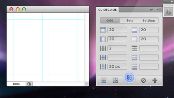
- Install special plugins for Photoshop ( GuideGuide , Modular grid pattern , GridMaker 2).
- Download a ready-made template from one of the free grid generators such as 960.gs, Golden Grid, 1Kb Grid, Simple Grid. Set the desired parameters and click "GENERATE".
In fact, there are quite a number of services for creating grids, including for "rubber" sites. They can be found very easily by using the search, so I see no reason to list them all in the article. These services are great helpers for beginners.
Creating a modular grid in
Unlike Photoshop, InDesign has its own modular grid creation tools. On the menu Layout you must select an item Create Guides and in the dialog box enter the parameters you need:

This tool has quite flexible settings, so it will not be difficult to create the desired structure. Meshing is best done on Master Page so as not to repeat the procedure for each page.
Creating a modular grid in
- The first method (similar to Photoshop) is to turn on the grid of the graphics editor itself and, guided by it, set the guides. It is also possible to make any shape a guide, which will help in organizing an inclined grid.
- Download ready-made grid templates. Where - the search will prompt. You can find a lot of them on the Internet.
I hope the topic of modular grids has become closer and clearer for you. Be sure to practice building them. I understand perfectly well that this is a very boring occupation, but it is worth it. Grids develop your sense of proportion, allowing you to better see any alignment inaccuracies later on.
An extremely useful article on the rules for creating a magazine layout! I highly recommend reading it.
Before we talk about the modular grid, let's understand what a module is.
Module Is a multiple repeating image, size or proportion. Is the structure (frame, template) of the arrangement of graphic elements on the pages. The basis of the modular grid is a “module”, in other words, the main grid spacing, which is visually determined by the width and height of the cage (modular unit). The cells are built using vertical columns and horizontal lines.
The vast majority of grids are based on the paper size used as the basis for the publication. As you can imagine, the columns and the basic grid of pages are created using the automatic commands of the program. The grid can be very diverse, depending on the purpose of the publication and the designer's idea.
The grid is created for the entire spread, not for each page separately. This is done so that the entire magazine spread would be perceived as a single whole, and not disintegrate into right and left parts, and the entire publication would not look like a binder of heterogeneous pages. The reversal grid can be composed of 2, 3, 4, etc. equal and unequal column widths.
Columns of equal width are created in the document creation window, or in the "Margins and Colomns" panel. If we need to set 3 columns, then we drive the number 3 into the corresponding field, etc.

But what if, according to our plan, not all columns should have the same width? For example, what if text and images are in 2 wide columns, and explanatory information is in a narrow side column?
In this case, our modular grid will be built based on miscellaneous the number of automatic columns of the program. For example, if we set 8 automatic columns for a page, then our 2 wide columns (for text and images) will occupy 3 automatic columns, and a narrow side column will be built on the basis of 2 automatic columns.


In addition to distribution by columns, the modular grid also uses basic horizontal rulers... Lines of text and borders of graphic elements are anchored to them for visual ordering and alignment.

Headings can fit in a single column or span multiple columns. It is not uncommon for the heading to be the only element for the entire page. It all depends on the creative idea and personal preference of the designer.


Likewise, graphic images (photographs or illustrations) can occupy one or several columns, or they can fill the whole spread. A fairly common technique is when a photograph takes up one part of the spread in its entirety and extends slightly to the second part in order to visually unite both parts.
-

The modular grid is not necessarily built from perpendicular lines. Sometimes the designer decides to tilt the mesh or even give it an original shape. If you want to go beyond the usual, go out!
Just try not to turn your work into Sisyphean work in the pursuit of originality. Imagine what it would be like to type 40-50 pages with a slanted or curly grid ...


-
Therefore, before getting original, ask yourself, is it really so necessary and for what? If the entire magazine is built on an inclined, inverted or curly grid, then, most likely, such originality will surprise the reader no further than during the first 5 pages, and then it will become annoying.
Why? Because the reader first of all wants to calmly read and assimilate interesting information, and not be distracted by any excess of the designer's genius.
But if the original layout appears only in one specific section of the magazine, then it will be not only interesting, but also appropriate, since it will give the section a stylish and recognizable look.
"The grid is a help system, but it is not a guarantee, it just has a number of possible uses, and each designer can find a solution that suits his individual style. But you have to learn how to use a grid. It is an art that takes practice."
— Joseph Müller-Brockmann
In fact, the very use of the grid is associated with one of the oldest and most basic design principles - alignment. Our brain wants to simplify everything and make it more understandable. This is why we try to bring order to things that seem chaotic.
Naturally, the faster we organize everything correctly, the faster our brain can identify the model and move on. The grids are so orderly that they require almost no interpretation on our part. .
Consider two page layouts presented in the image below:
Although both of these images are just a few rectangles, the set at the top seems to be fundamentally better than the bottom. We can instantly recognize the pattern, accept it, and move on. The image below, on the other hand, causes visual discomfort, since it does not have a clear picture, order, or purpose and looks like a random set of shapes.
It should be noted that disorganization can also be beautiful. . In nature, for example, there are no clear lines. Meshes look cold and stiff, but remember that they are a very effective and efficient method to keep your imagination from getting bogged down in structures.
Take a look at some of the most popular websites with top-notch designs. Most likely they used a grid. Grids help stabilize the structure of a web page and provide the designer with a logical template for building a website.
Using a grid doesn't mean your design will have a boring design. A good designer should know and be able to apply the basic rules for using the grid, but this does not mean that he cannot break the rules.
In simple terms, a grid is the division of a layout with vertical and / or horizontal guides including margins, space, and some columns to lay the foundation for organizing your content.
Grids are traditionally used in the printing industry, but they are also commonly used in web design. The mesh is just a tool that helps with the design.
When starting to learn new skills in a particular area, you must first follow the guidelines. Learning the basics ensures that you can apply the principles effectively. That is, first - theory, and then - practice.
It's worth noting that there are two ways to create a template grid:
Method # 1: Create Your Own Grid
There are many different ways to create your own mesh, but at the end of the day, you are free to choose which one works best.
You can divide a blank document mathematically, creating an even or odd number of columns to work with. Your network can be complex or simple, you can use the rules of thirds or the golden ratio as you like.
Perhaps the following articles will help you with this:
- How You Make A Grid (book in English in .pdf format)
Here are some examples of meshes created in Photoshop using guides ( View> New Guide):

Plugins for creating grids in Photoshop


5. Grid System Generator -generator of such popular grids as 960.gs, Golden Grid, 1Kb Grid, Simple Grid / set the necessary parameters and press "GENERATE".


Grids for gummy / responsive sites
Responsive web design is hugely popular today. The main of its principles is the use of a rubber mesh. You can read more about them, but I would like to supplement this collection a little and add a few more resources.
1. - adaptive grid generator

2. Fluid grid calculator - a service that allows you to create a rubber grid. Enter the parameters and get a ready-made code.
Written by Josef Müller-Brockmann (1914–1996) is a graphic designer and teacher. His work is an example of simplicity in design and subtle use of typography, shape, color. They have influenced many contemporary designers.
The website of the Lebedev Studio says that the book is not for sale. I advise you to look into one of the official stores. I've wanted to read Modular Systems in Graphic Design for a long time. I thought that it was no longer being sold. After defending the semester work at the BHShD, I stumbled upon Lebedev's studio store. It turns out that they print it and sell it.
I bought and read the book. I will share my impressions and interesting ideas.
Examples of layouts are provided for each topic. Since the book is slightly larger than A4 sheet, the illustrations are large and detailed.
 Sample pages using a modular grid
 Note to the designer
Josef describes the process of working on the layout of the poster, the page layout of the book and the magazine. The part is devoted to typography issues, as it affects perception. A designer needs to be able to understand these intricacies in order to successfully complete their work.
About grids
The modular system helps the designer to rationally arrange the elements on the page, but it's important to remember: the content first, and then the grid.
Liked?
tell


 new brushes in Photoshop?")


