When you need to mix the primary colors and get your favorite purple, green, orange shades, the way you get them depends on many factors. The question is, do you mix pigments or light? We will tell you how to work with any materials and share ways to get all the colors of the rainbow!
Steps
Color Mixing: Subtractive Colors
- Note: Black can be obtained by mixing the available colors. Black pigment, of course, exists, but its use is too conspicuous. It is better to get dark colors by mixing transparent primary colors: shadows also have shades depending on the time of day and other factors.
- Read the "Other Tips" section below for guidance on choosing the best magenta and cyan.
-
Mix red and blue. Everyone knows that red and blue, when mixed, make purple, right? Indeed, but this is not that bright, lively purple. Instead, they form something like this:
- Not very pleasing to the eye, is it? This is because red and blue absorb more and reflect less spectrum, resulting in a dark, dirty purple instead of a vibrant, vibrant one.
-
Now try this: mix magenta with a little cyan and you will see the difference. This time you will get something like this:

- Magenta is a shade of purple, cyan is a blue-green hue, often referred to as bright blue or turquoise. Along with yellow, they are the primary colors in the CMYK model, which is based on a subtractive color scheme (obtaining color by subtracting individual components from white). This scheme is used in printing, including color printers.
- You can see that using the real primary colors - magenta and cyan - results in a much brighter and more vibrant hue. If you want a richer purple, add more blue. Add black for dark purple.
-
Mix pigments to get primary and secondary colors. There are 3 main color pigments: cyan, magenta and yellow. There are also 3 secondary colors obtained by mixing two primary colors:
- Cyan + yellow = green
- Cyan + magenta = blue
- Magenta + yellow = red
- Cyan + magenta + yellow = black
- In subtractive color mixing, the combination of all colors produces black.
-
"See the information below. See the "Mixing Colors" section for more detailed tips on how to achieve a wide variety of shades, including light, dark, and greyish. The Tips section provides an extensive list of colors and combinations that can be used to get those colors on the palette.
Light Blending: Additive Colors
-
Take a look at your monitor. Look at the white areas on this page and get as close as possible. Even better if you have a magnifying glass. Bringing your eyes closer to the screen, you will see not white, but red, green and blue dots. Unlike pigments, which work by absorbing color, light is additive, that is, it works by adding up light fluxes. Movie screens and displays, whether it's a 60-inch plasma TV or the 3.5-inch Retina display on your iPhone, use additive color mixing.
Mix light to get primary and secondary colors. As in the case of subtractive colors, there are 3 primary and 3 secondary colors obtained by mixing primary colors. The result may surprise you:
- Mixing red + blue = magenta
- Mixing blue + green = cyan
- Mixing green + red = yellow
- In additive color mixing, the combination of all colors produces white.
- Note that primary additive colors are secondary subtractive colors and vice versa. How can it be? Know that the effect of subtractive color is a combined process: it absorbs some colors, and we perceive what is left, that is, the reflected light. The reflected color is the color of the light output that remains when all other colors have been absorbed.
Modern color theory
-
Understand the subjective nature of color perception. A person's perception and identification of color depend on both objective and subjective factors. While scientists can define and measure light down to the nanometer, our eyes perceive a complex combination of not only hue, but also the saturation and brightness of a color. This circumstance is further complicated by the way we see the same color on different backgrounds.
Hue, saturation and lightness are the three dimensions of color. We can say that any color has three dimensions: hue, saturation and lightness.
- Tone characterizes the position of a color on the color wheel - red, orange, yellow, and so on, including all intermediate colors, such as red-orange or orange-yellow. Here are a few examples: pink refers to a magenta tone or red (or somewhere in between). Brown refers to an orange tone because brown is a dark orange.
- Saturation- this is what gives a rich, vibrant color, like on a rainbow or color wheel. Pale, dark and muted colors (shades) are less saturated.
- Lightness indicates how close a color is to white or black, regardless of the color. If you take a black and white photograph of flowers, you can tell which ones are lighter and which ones are darker.
- For example, bright yellow is a relatively light color. You can lighten it even more by adding white and making it a pale yellow.
- Bright blue is naturally dark and low on the light scale, while dark blue is even lower.
Mixing paints
-
Follow this guide to get any color you want. Magenta, yellow and cyan are the primary subtractive colors, which means that any other color can be obtained by mixing them, but they themselves cannot be obtained from other colors. Primary subtractive colors are used when mixing pigments such as inks, dyes and paints.
Colors with low saturation (dim colors) come in three main types: light, dark and muted.
Add white for light colors. Any color can be lightened by adding white to it. To get a very light color, it is better to add a little bit of the main color to white so as not to waste excess paint.
Add black for dark colors. Any color can be darkened by adding black to it. Some artists prefer to add a complementary (complementary) color that is opposite the given color on the exact CMY/RGB color wheel. For example, green can be used to darken magenta and magenta can be used to darken green because they are opposite each other on the color wheel. Add black or complementary color a little at a time so as not to overdo it.
Add white and black (or white and a complementary color) to get muted, grayish colors. By changing the relative amount of added black and white colors, you can get any desired level of lightness and saturation. For example: add white and black to yellow to get a light olive. The black will darken the yellow, making it olive green, and the white will lighten that olive green. Various olive green shades can be obtained by adjusting the amount of paint added.
- To obtain a desaturated color, such as brown (dark orange), you can adjust the hue in the same way as for a bright orange - by adding a small amount of colors nearby on the color wheel: magenta, yellow, red or orange. They will make the brown more vibrant while changing its hue. But since brown is not a bright color, you can also use colors on the other sides of the triangle, such as green or blue, which will darken the brown while changing its hue.
-
Get black. This can be done by mixing any two mutually complementary, as well as three or more equidistant colors from each other on the color wheel. Just don't add white or any color that contains white unless you want to get a shade of gray. If the resulting black leans too much towards a particular color, neutralize it by adding a little complementary color to that color.
Don't try to get white. White cannot be obtained by mixing other colors. Like the three primary colors - magenta, yellow and cyan - you will have to buy them, unless, of course, you work with materials like watercolor, for which paper itself is used instead of white if necessary.
Develop an action plan. Think about the tone, lightness, and saturation of the color you have and the color you want to achieve, and make adjustments accordingly.
- For example, a shade of green can be brought closer to cyan or yellow - its neighbors on the color wheel. It can be lightened by adding white. Or darken it by adding black or its complementary color, namely purple, magenta or red, depending on the shade of green. You can tone it down by adding black and white, or make a desaturated green a little brighter by adding (bright) green.
- One more example. You mixed red and white to make pink, but the pink came out too bright and warm (yellowish). To correct the warm tone, you will have to add a little magenta. To tone down a hot pink, add white, a complementary color (or black), or both. Decide if you want a darker pink (add only the complementary color), taupe pink (add white and complementary color), or just a lighter pink (add only white). If you're planning on adjusting the hue with magenta and muting the pink with green or cyan (complementary to magenta and red), you can try combining the two by using a color between magenta and cyan, such as blue.
-
Mix paints and start creating a masterpiece! If all this seems impossible to you, you just need a little practice. Creating a color guide for your own use is a good way to practice using the principles of color theory. Even by printing it out from a computer, you will provide yourself with useful information while you still have no practice and you cannot work on an intuitive level.
Color samples and how to get them
- Choose the color you would like to receive and follow the instructions below. Each pattern provides a range of possibilities; you can adjust the amount of paint used to get exactly the color you want. For example, any light color can be lightened or darkened by adding more or less white. Complementary, or complementary, colors are colors located opposite each other on the RGB/CMY color wheel.
- Red: Add some yellow or orange to the magenta.
- Light red (salmon pink, coral): Add white to red. Use less white and more red to get coral.
- Dark red: Add some black (or cyan) to red. Cyan is complementary to red.
- Muted red: Add white and black (or cyan) to red.
- Yellow: Yellow cannot be obtained by mixing other colors. You will have to buy it.
- Light yellow: Add white to yellow.
- Dark yellow (olive green): Add some black (or purple-blue) to the yellow. Violet-blue is complementary to yellow.
- Muted yellow (light olive): Add white or black (or violet-blue) to yellow.
- Green: Mix cyan and yellow.
- Light green: Add white to green.
- Dark green: Add some black (or magenta) to the green. Magenta is complementary to green.
- Grey-green: Add white and black (or magenta) to green.
- Cyan (turquoise blue): Cyan cannot be obtained by mixing other colors. You will have to buy it.
- Light cyan: Add white to cyan.
- Dark cyan: Add some black (or red) to cyan. Red is complementary to cyan.
- Grey-blue: Add white and black (or red) to cyan.
- Violet blue: Mix magenta with cyan or blue.
- Light Violet Blue (Lavender): Add white to purple-blue.
- Dark purple blue: Add some black (or yellow) to violet-blue. Yellow is complementary to purple.
- Greyish Violet Blue: Add white and black (or yellow) to violet-blue.
- Violet: Mix magenta with a little cyan, blue or violet blue.
- Light purple: Add white to purple.
- Dark purple: Add some black (or lime green) to purple. Lime green is complementary to purple.
- Muted purple: Add white and black (or lime green) to purple.
- Black: Black can be obtained by mixing any two complementary colors or three colors equidistant on the exact CMY/RGB color wheel, such as red, green, and blue. If you get a dark color instead of pure black, correct it by adding its complementary color.
- White: White cannot be obtained by mixing other colors. You will have to buy it. To get a warm white (such as cream), add some yellow. To get a cool white, add a little cyan.
- Grey: Gray is a mixture of black and white.
- When mixing paints, add them little by little to control the color. You can always add more. This is especially true when working with black and blue, which tend to dominate other colors. Add a little at a time until you get the desired result.
- To find out if a color is complementary, use your own eyes. It's an old trick: look closely at a color, then look away at a white surface. Due to the "color fatigue" of the eyes, you will see the opposite color.
- Choosing primary colors when shopping can be tricky. Look for a magenta that is free of white and blue pigments (PW and PB). Violet and red pigments such as PV19 and PR122 work best. Good cyan PB15:3. PB15 and PG7 are also good. If you need art paints or glazes, you can try to match the colors with a printer. Print a sample from your computer to a printer to take with you to the store, or look for the primary colors on the sides of a cereal or cookie box.
- You need one color triangle of colors that provide visual balance to the picture, and another color triangle to determine pairs of colors that cancel each other out, since complementary colors for these tasks are slightly different. So, ultramarine works well with lemon yellow and other beautiful yellows, but to darken these yellows, use purple. More information on this subject can be found online.
- How many tubes of different paints do you really need to paint a picture? Jean-Louis Morell's book on watercolor painting shows how, using the cyan-yellow-magenta color triangle, to get almost any desired color from just four or five, but this can also be done using these three plus white (as white in watercolor painting protrudes paper)!
- The best range of shades can be obtained by mixing colors that are close to the CMY primary colors, but to get a darker shade, one - or even better two - should be darker than these primary colors, for example, Persian blue or cobalt blue, crimson alizarin.
- What are you writing? The colors you need depend entirely on what you're writing. For example, ultramarine, Neapolitan yellow, burnt sienna and white are useful for distant landscapes if bright greens and yellows are not needed.
What will you need
- Palette - disposable paper is well suited.
- Palette knife (any size)
- Watercolor paper or primed canvas (available from your local art supply store; ready-made primed canvas works well)
- Containers with water or solvent for washing brushes
- Synthetic brush of your choice (#8 round or #6 flat works well)
- Spray bottle to keep water-based paints from drying out
- Paper towels to remove dirt and clean brushes
- Color circle
- Paints
- A bathrobe or an old shirt that you don't mind getting dirty
- Gloves
-
Take paint. Any kind of paint will do - even those used on furniture or walls - but it's best (and cleaner) to practice with a few small tubes of oil or acrylic paint. First, let's see what happens if we mix just two colors - red and blue.
The color of clothes endows us with qualities that each of us would like to develop in ourselves. Although, it is much more important that the color helps to discover or increase the energy inherent in each person, and it, of course, is different for people. On a conscious or unconscious level, each of us chooses clothes of the color that will be combined with the natural color, more specifically, the color of hair, eyes, and skin is always important.
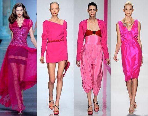
Pink and its shades give freshness to a woman's face. On top of that, for a man, a girl in a pink dress seems just as sexy as a girl in red.
Despite this, pink cannot be overdone, because this tone, in addition to love, hope and dreams, is often associated with vulgarity, bad taste, obscenity and excessive naivety. Often pink "hints" at mental narrow-mindedness and complete detachment from reality. Pink color has a large number of shades. Its most famous shade is magenta.
Magenta
This color can be described as a bright purple or rich pink. You can relate to this color in your own way, although basically it generates only positive emotions. Adults associate the color of the cuff with something unrealizable, short-lived and strive not to use it. Psychologists associate the magenta color with the desire for change. When a person himself, without realizing it, attracts the color of a cuff into his life (buys clothes or an interior item), in this way he categorically decided to change something in life, and change for the better.
Magenta color in clothes
A shade of magenta is beauty, style, glamor, effect. In essence, magenta is a rather conditional name, this is the name of a special group of shades obtained by combining (certain proportions) of red and blue colors. Since magenta is made up of two waves of color of different lengths, it cannot be classified as either a cold or a warm type of flower. The cuff will make any attire amazing, so this color suits almost every woman: fair-haired, dark-haired, full, thin, young and old.
Electronic magenta is the most popular fuchsia color. It has a characteristic special shade, so in clothes the fuchsia color gives the impression of something refined, sublime and sophisticated. The appearance in clothes of ultra-pink color or, as it is briefly called, neon pink, the podium owes to the fashionable Italian designer reformist Elsa Schiaparelli.
How to combine majet color with other colors?
In clothes, magenta is a symbol of tenderness and sensuality. Every fashionista should know how to properly combine magenta and other tones in clothes in order to make a vivid impression on others. The most win-win option is to combine magenta and black. Thanks to this aristocratic color, a naive girl becomes an elegant, imposing lady. White color gives magenta lightness and lightness. The classic option is to combine magenta with gray. A gray outfit in itself brings boredom and despondency, and this colorful, concentrated shade will add dreaminess and originality to it. More restrained ladies will suit a combination with purple, magenta is a good "friend" of a blue tint.


A tip from designers is to combine the frivolous and picturesque color of magenta with more serene tones, say, milky, lemon, beige or light green. Gorgeous office ensemble - cream skirt, pink top and matching shoes. A bright woman for her image chooses magenta with accessories and trousers in bluish-green. Wear a red top and hot pink shorts for a casual ensemble. Today, the cuff is the choice of sensual girls who understand all the subtleties of the fashion industry and look amazing at all times.
Magenta color is one of the primary colors, an integral part of the basic palette for painting.. Magenta dye was synthesized in 1856 and owes its name to the bloody battle near the Italian city of Magenta. Magenta dye has a very low level of lightfastness, so these red-pink colors are now produced on the basis of quinacridone pigments.
Story
The industrial revolution of the 19th century made it possible to chemically synthesize many dyes previously obtained from natural sources. Since then, synthetic dyes and pigments have been separated. The names of natural colorants (pigments) often contain the name of the plant, animal, or geographic region from which they originated. For example, the color "madder" (from the plant "Madder dye"), the color of sepia (from the Latin "squid" - a clam or squid), the color "yellow Indian". The pigment, synthesized in 1856, bore the unpronounceable name "triaminotriphenyl carbonate chloride". The shade was very reminiscent of the color of the fuchsia plant, which is why it was often called “Fuchsia”, and later the color was called “Magenta”.
The battle, after which the color of magenta was named, took place in 1859 in Italy near the city of Magenta between the Franco-Sardinian troops and the Austrian. France, despite the numerical superiority of the opponent, was able to win at the cost of impressive losses (4,000 killed and wounded from France and 5,700 from Austria). Contemporaries of the events said that the battlefield was red with blood. In honor of this fight, the dye obtained three years earlier was named.

The resulting dye was not suitable for creating thick art paints. First of all, it was necessary to "precipitate" the color onto a colorless pigment in order to obtain a "varnished pigment". After the implementation of this chemical process, the resulting pigment can be used to make paints. But even after that, light fastness is far from ideal. Nowadays, magenta color is produced on the basis of quinacridone pigment, which has the highest level of lightfastness.
Dye or pigment, what is the difference
In dry form, dyes and pigments are easy to confuse. The difference becomes apparent after mixing the dry matter with a binder or solvent. If the substance dissolves like sugar in hot water, then it is a dye that is suitable for use in liquid ink. The pigments do not dissolve in a binder or solvent and are suitable for the production of thick paste paints.
One of the most important properties for professional artists is light fastness. Dyes fade when exposed to light.. While pigments retain their original color for a long time.
The magenta color (quinacridone) with the highest level of lightfastness is available in the following ranges of Royal Talens art paints:


Oil paints Royal Talens Rembrandt, color 366 ()
Royal Talens Rembrandt watercolors, color 366 ( )
Oil paints Royal Talens Van Gogh, color 366 (
Royal Talens Van Gogh watercolors, color 366 (
If you often communicate with fashionistas, interior designers, artists or makeup artists, you may get the impression that these people live in a completely different world with their own terminology.
“These are beautiful indigo shades!”, “Magenta will be the base color in your living room?”, “Marengo suits your eyes!”. In fact, there are many more colors and shades than we used to think. This article will discuss what the color "magenta" is and how to use it correctly.
Calling colors by their names
“Why not limit ourselves to the concepts of “red”, “blue”, “yellow”? Why these inventions in the form of beautiful words, the meaning of which is understood only by the initiates? That is probably what most people think. This is partly true when it comes to basic, spectral colors. But combinations of two or more waves of different spectra form new colors and, accordingly, new names. If we talk about the color called "Magenta", then figuratively speaking, you get it by mixing red and blue colors in different proportions.
"Magenta" - the history of the name
In fact, the name "magenta" is the designation for a number of purple shades.
To obtain this color, coal tar is used. The dye was created in the middle of the nineteenth century and was actively used by doctors due to its antiseptic properties. It gained particular popularity during the battle in northern Italy near the city of Magenta, from where its name came from, which has survived to this day.
What color is magenta?
Photographs that allegedly show the shade "magenta" can show completely different colors. This is not surprising, since magenta is the cumulative definition of several shades.

"Typographic magenta" - a color close to raspberry. It appeared at the end of the last century, when printing of color comics began.
"Electronic magenta" was created to convey hue in computer color reproduction. This one has a purple tint. This same color is also known as "fuchsia".
"Pale magenta" resembles light pink fuchsia.
"Dark magenta" - lilac-violet color.
"Heavenly magenta" - a color whose photos show more saturated purple hues. Reminiscent of the color that appears in the sky at the moment of a pink sunset, hence the name.
Good combination of magenta and other colors
Purple is called the color of kings, the color "magenta" defines lighter purple hues, and therefore has all the same royal qualities of calm and grandeur.

By no means can it be said that this color is “girlish” or “feminine”, this color is rather universal due to its restraint.
If you want to create a successful image in the interior or wardrobe, then keep in mind that noble pink goes well with white and beige colors, dark blue, light pink and yellow. It is these shades that emphasize the magenta color.
What shade is not combined with a noble light purple? First of all, it is red, blue, thanks to which magenta turned out. Not entirely successful magenta will look next to green and black. Keep this in mind when you start design metamorphoses in the house or select things by color combination.
How to use magenta in the interior?
This color is noble and calm, but if you want to “decorate” a room with this color, you should use magenta carefully. First of all, it is not recommended to paint small rooms with magenta, so as not to make them even smaller. Also, if your home is designed in a conservative style, magenta will bring some resonance with the overall situation. Magenta loves high-tech, spacious bright rooms, walls with uneven texture.

Therefore, noble fuchsia is great for decorating large rooms, especially if it is a fitness club or a hotel apartment. Also, the magenta color will suit perfectly if you use it when decorating a restaurant. Majestic and a bit mysterious, it will give visitors an atmosphere of mystery and solemnity.
Use light magenta shades to paint rough surfaces, so this color will appear even deeper and more majestic.
How to use magenta in the wardrobe?
Magenta is a "strong" color. If you do not want to stand out from the crowd, prefer a conservative and strict business style, then royal "fuchsia" can make you feel uncomfortable, this is absolutely not your color.

Magenta - what shade regarding the wardrobe, light purple or deep pink? Whatever it is, feel free to use it if you consider yourself a strong person with pronounced leadership qualities. Magenta will give you confidence, especially if you lead an active lifestyle, engage in social activities, and occupy a leadership position.
Once again, we recall that it is a mistake to consider magenta a “female” color. Men can tie a magenta tie or wear a magenta-colored shirt in combination with a thunder-colored suit or in combination. However, you should not wear a suit of purple shades, otherwise the look will turn out to be too flashy.
Girls should also be careful with magenta. Don't overload your look with this color. Also, do not wear too many shiny accessories if you are wearing a jacket or dress in purple tones. If you decide to choose fuchsia shoes, then all other clothes should be in soothing neutral colors.

Basic printer colors
In the process, base colors are understood as four colors of the CMYK subtractive color model (C - cyan, cyan; M - magenta, magenta; Y - yellow, yellow; K - blacK, black). The CMYK color model describes the actual dyes that are used in the printing industry and in large format printing equipment. The four basic CMYK colors are the minimum required for color printing, as when mixing these colors in certain proportions, theoretically, you can get any others.Additional printer colors
However, CMYK printers do not do well with gradients (smooth transitions from color to color). Two additional light colors Light Magenta (light magenta) and Light Cyan (light cyan) have been added to the basic CMYK colors to expand the color gamut and improve the naturalness of color rendering. It was the color cartridge with six colors that became the main difference between Epson photo printers of the Stylus Photo line.Since the base regular and additional light inks have different concentrations of dye, it was possible to achieve better print quality in light areas - no grain in light areas. It became possible to reproduce 4 times (!) More shades. For example, the traditionally wider color gamut for textile printing has been extended to CMYK + Blue. Today, the accepted scheme in digital inkjet printing for textiles is CMYK + Orange (Red) + Blue.
In 1994, the Pantone Hexachrome (CMYKOG) color model was introduced. Two new colors have been added to the four CMYK colors: green (G) and orange (O). Thanks to this, many Pantone shades (up to 90%) became available, while CMYK transmitted about 50%. And the range of reproducible colors of CMYKOG exceeds the color gamut of RGB.
Today, Epson UltraChrome HDR pigment inks provide 98% Pantone color gamut. The set includes 10 ink colors: standard or matte black, gray, light gray, cyan, light cyan, rich magenta, rich light magenta, yellow, green and orange.
White and metallic have been used as secondary colors, allowing you to print bright images with a bright white color and a metallic effect on films, vinyl, canvas, photo paper, etc. For example, second-generation Epson UltraChrome GSX eco-solvent ink contains white ink and metallic silver. However, it is immediately worth mentioning that these inks have a special chemical composition and their cost is quite high. The ink is not designed for continuous filling, we are talking about fragmented use on dark and transparent media.
2 types of black ink have been specially developed to achieve perfect results on different types of paper. For printing on matte media - Matte Black, which guarantees the deepest black color, and for glossy and semi-gloss media - Photo Black.
It is worth remembering that the color scheme cannot be changed. For example, an 8-color printer, the user cannot upgrade to a 10-color model. And vice versa, in the 10-color model, additional colors cannot be blocked.


